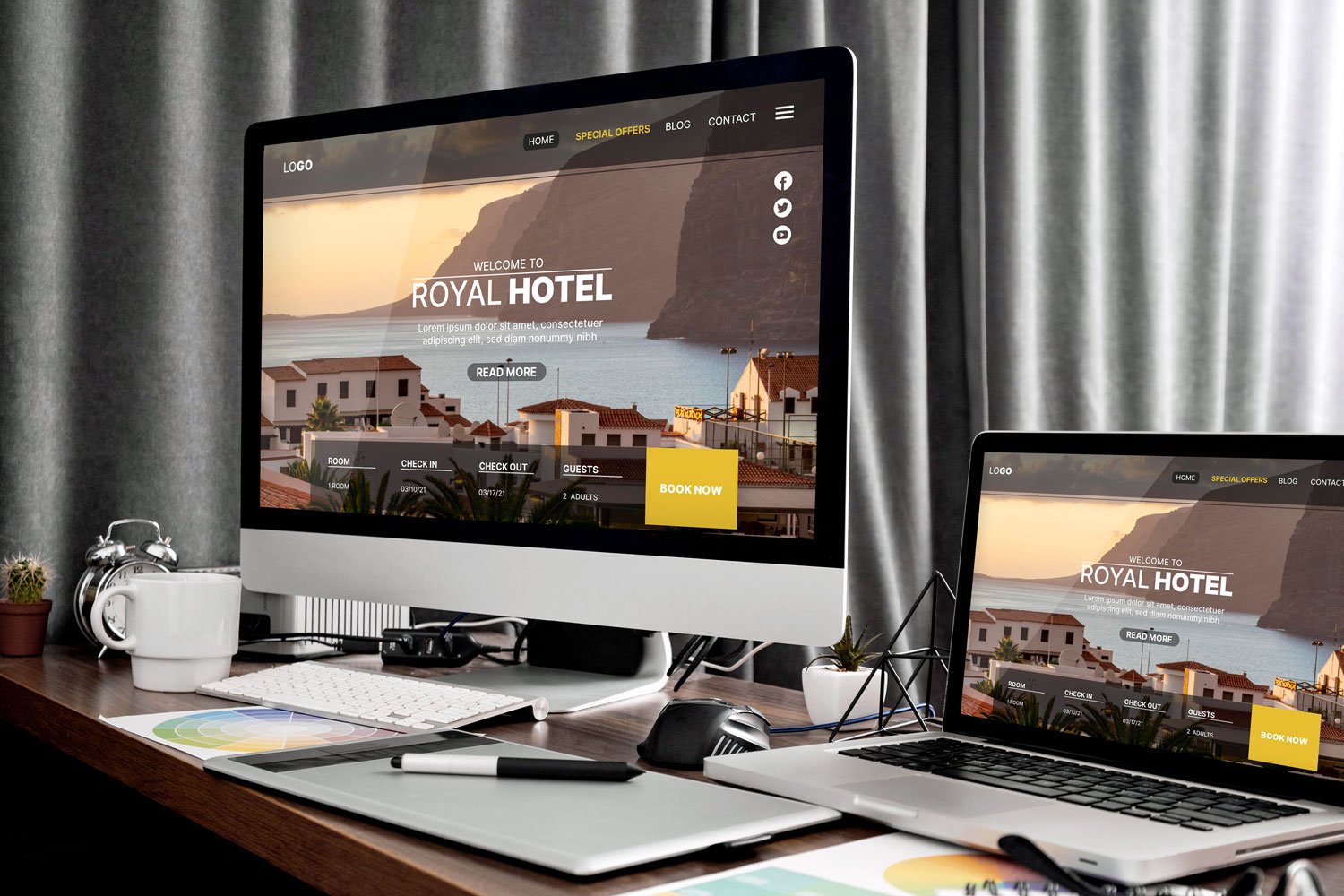
Why crafting a website that your users will love requires a strong design strategy
Websites should be built for both robots and humans. Robots are the big search engines, and the right content and SEO will drive traffic to your site, but the reality is that it is humans who read and consume websites. Focusing solely on SEO often results in users leaving your site as soon as they arrive, and them eventually landing on somewhere else to find what they need.
The lesson here is: design matters - you need to deliver your content in a way that’s appealing to human eyes, and that’s as important as the content itself.
When it comes to how to get started on a website design that works for you, here are some tips that we give freely to all our clients, and to anyone else who asks:
1. Define your audience
Before diving into design, it's important to have a clear idea of who you're trying to reach and what they care about. Are you aiming for a younger, trendy crowd, or are you targeting serious corporate clients? Your design should match your audience.
2. It needs to work everywhere
Over the last 10 years, we’ve seen web users shift from desktop to mobile, at a drastic rate. The average website we build now see over 60% of users viewing on their phones rather than a big screen - that's why your design needs to work well on phones, tablets, and computers.
3. Clear Navigation
Navigation should be like telling a story. Make it easy for people to move around your site and find what they're looking for. It’s helpful to have main navigation links written in plain English, and primary content pages should be accessible using a single click from the menu, not hidden behind multiple click interactions.
4. Pick the Right Colors
Colours convey not only style and emotion, but the correct choice of colours is now necessary to accomodate users with accessibility requirements. Choose colors that match your brand, but also ensure that your colour contrast follows AODA best practices so your site properly serves all web users.
5. Use Fonts Wisely
Font selection is usually an afterthoguht, but it’s an important of your site’s personality - it is your site's voice. Make sure they're easy to read and fit with your brand's personality. Keep them consistent across your site so things look cohesive.
6. Use Pictures to Tell Your Story
Images help bring your site to life. Whether you're using your own photos or stock images, make sure they fit with your brand. Add your own style to stock images to make them feel unique to your site.
In the end, good design is all about making people feel welcome and understood. By following these simple tips, you can create a website that people love to visit, no matter who they are or what device they're using.
Author
Steven Farrace is a the chief designer at Promentum Technologies, and has been crafting exceptional digital and physical media over three decades.


